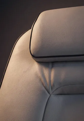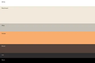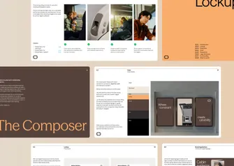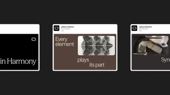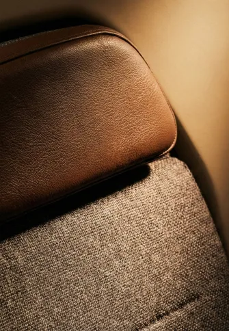
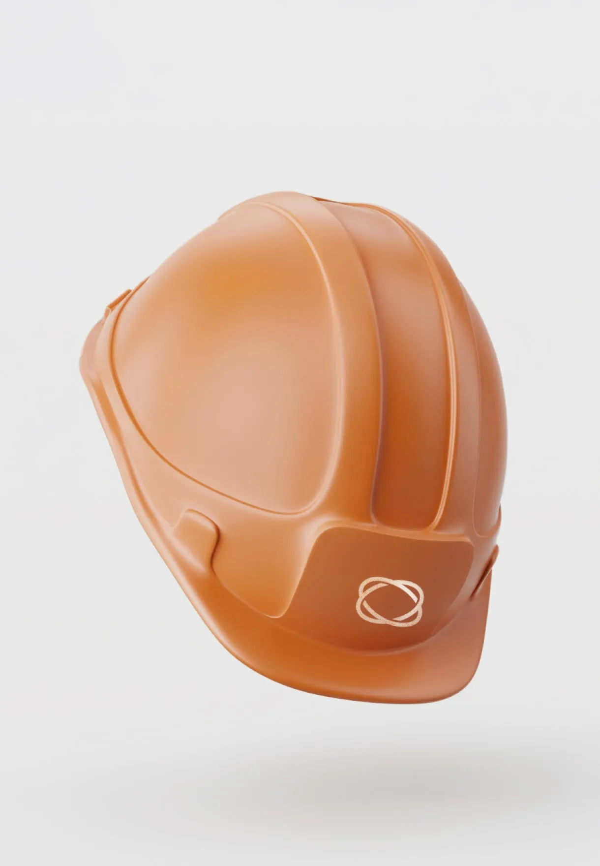
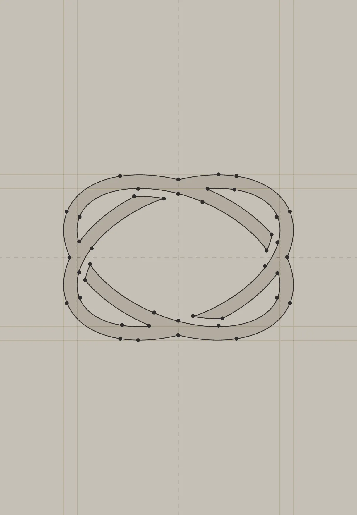
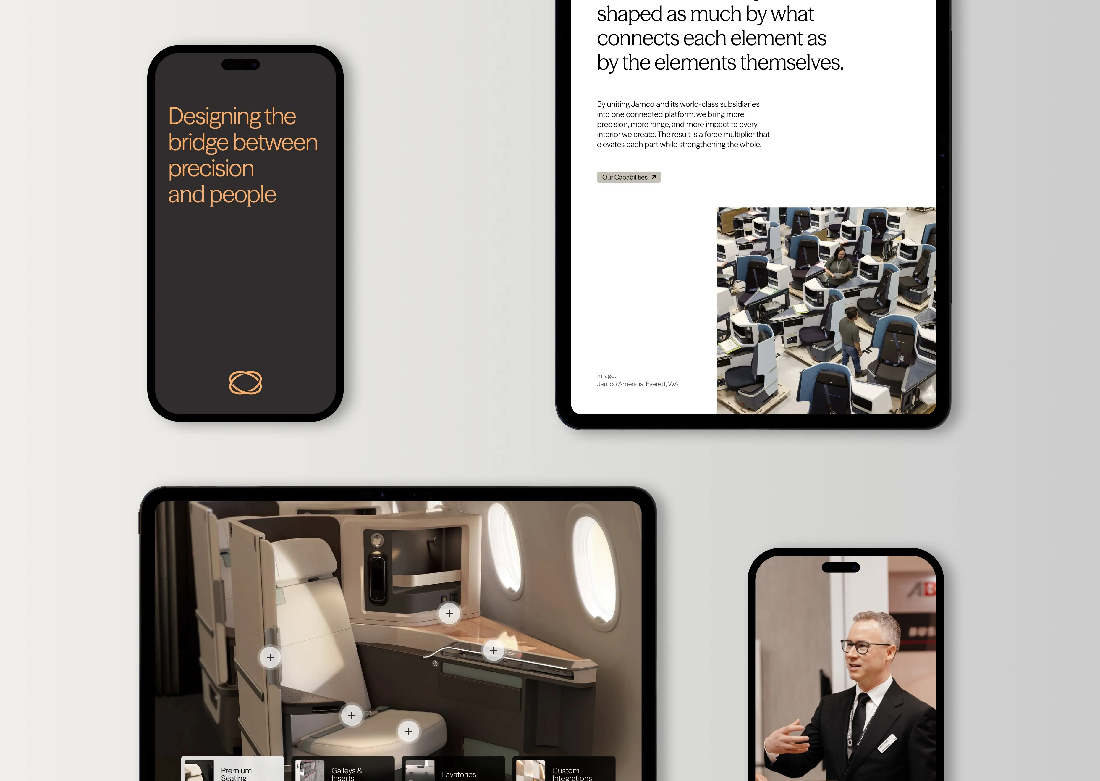
The idea of composing ecosystems shaped the identity. We evolved their heritage logo into a connective knot to symbolize unity. To shift focus inside the cabin, we replaced expected aviation blues with tactile, atmospheric hues like Basewood Brown and Bridge Amber. The typography pairs precise sans-serifs with expressive serifs, visually bridging the gap between exact engineering and human comfort. Anchored by the tagline "Design in Harmony" and photography centered on real moments, the system equipped Jamco with a premium toolkit to launch their new era at the Aircraft Interiors Expo (AIX).
Jamco Interiors

Known for premium design but stuck talking about parts. We helped them become the composer of premium cabin ecosystems.
Jamco Interiors crafts premium aircraft interiors that transform the flying experience. But while their engineering led the aerospace industry, their messaging historically focused on the isolated parts they built. They were widely viewed as a supplier of components rather than a creator of premium environments. The brand needed to elevate its story to reflect the true scale of its craft and confidently claim ownership of the entire cabin experience.
Together with Proto, we positioned Jamco as “The Composer,” a connective force that balances technical utility with human-led design. Instead of highlighting individual products, the new strategy focused on how those pieces integrate to orchestrate premium cabin ecosystems. This shift gave them a new platform for the brand, helping audiences understand that exceptional travel experiences are thoughtfully composed rather than simply assembled.
Expand
Jamco Interiors Brand in action
19